Changing the colours of art can be a great way to increase the amount of content in your game, and add variety and richness. It is relatively easy to implement. What is not always as easy is to get a set of colours that looks nice. This article gives some ideas for choosing colour palettes that look nice.
A few things about colour
Colour is surprisingly complex. How colour works is determined by the physics of light and materials, the biology of our eyes and brains, mixed with a bit of psychology.
Although you don’t need to know all about the physics, biology, and psychology of colour vision, it is useful to have some background information (which you can find references to at the end of this article).
For palette choosing, there are a few important points.
Digital colour theory differs considerably from theories based on pigments (or chemicals, or metals in crystals). In fact, no system of colour mixing can produce all colours that occur in nature. You can buy a dark very bright green from a paint shop, but the closest colour your screen can reproduce will look desaturated (just look at images of painted colour wheels). When you research colour for algorithms, make sure that they apply to digital RGB colour.
Vector distances in RGB and many other colour models don’t correspond to differences in perception.
Edit: Turns out I have fallen prey to the very thing I talk about. The descriptions below are true on my monitor, but need not be on your monitor. The main point stands though – RGB values and perception are different (especially when you throw in the variability of display devices).
Brightness

These greys are equally spaced. But notice how much easier it is to distinguish between lighter greys.
Hue differentiation.

In each row, the hue differs by 5%. Notice that certain colours cannot be distinguished. Also notice that it is different depending on the brightness. Lighter blues is more distinguishable than darker blues, while darker magentas are more distinguishable than lighter ones.
This fact becomes important when you try to select colours that look “equally” far apart; in general, it cannot be done without using a perception-based colour space (such as LAB colours), or making appropriate adjustments in other colour spaces.
Here is a bit more on the matter:
Here is an a way of computing a useful colour distance that may come in handy later:
- http://www.emanueleferonato.com/2009/08/28/color-differences-algorithm/
- http://www.emanueleferonato.com/2009/09/08/color-difference-algorithm-part-2/
Lab colour spaces are intended to be perceptually more uniform, and may be the basis of colour selection algorithms that give visually more pleasing results. (Photoshop gurus will know that hue adjustments have fewer artefacts when manipulating LAB channels and not RGB channels).
Colour perception is not absolute. Colours appear differently depending on surrounding colours. This is an important factor when selecting colour palettes that work with existing palettes, or combining more than one palette.

Here is more information on colour contrast effects:
Colour harmony theory. Although why certain combinations of colours look better than others is somewhat of a mystery, theories of colour harmony is a good place to start understanding many good-looking palettes.
See for example:
- Basic overview http://www.malanenewman.com/color_theory_color_wheel.html
- An overview of different theories http://colour-emotion.co.uk/harmony.html
Uses of procedural palettes
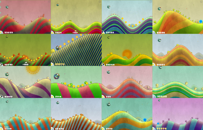
Procedural palettes can be used to:
- Get more variety in successively generated scenes, such as in Tiny Wings.
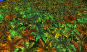
- To get more variety from a single asset, as shown below.
- To get automatic colours for interface components, such as in the (notoriously ugly) graphs of earlier versions of Microsoft Excel or and Open Office Calc.
Considerations
When selecting algorithms, you must think about what you need:
- How many colours do you need? A few, or many? A fixed number, or an arbitrary number?
- How should the colours in the palette relate to one another? For example, should the colours form a harmonic triad?
- Do you need a high contrasts palette or a palette with a minimum vector distance between colours?
- What colours will be used with the procedurally selected colours?
- Will you colour convey meaning? Do they need to match real-world elements? Are they used symbolically to distinguish between different types of elements?
- What type of variety do you need? Variety in successive generations? Variety in a scene?
7 Algorithms
1. Choosing random colours from a handpicked pre-set
This very simple algorithm gives the most control, and is easy to implement. It is only useful for smaller palettes, and of course all palettes are limited to the original set. However, it can be combined with other algorithms to give bigger sets of colours.
2. Uniform Random RGB
The simplest algorithm for selecting colours procedurally is to simply choose random values for each of the three RGB channels.
color = new Color(Random(), Random(), Random())

This algorithm gives sets of colours the are usually quite ugly. There is no structure, no relationship among colours in the palette, no pattern that pleases the eye. All the algorithms below attempt to constrain the colours generated so that there are relationships or coherence among colours.
3. Random Offset
This algorithm computes a palette by computing a small random offset from a given colour.


An easy implementation simply calculates random offsets for each of RGB components. An alternative is to just change the value of the colour by a random offset.
float value = (color.r + color.g + color.b)/3;
float newValue = value + 2*Random() * offset – offset;
float valueRatio = newValue / value;
Color newColor;
newColor.r = color.r * valueRatio;
newColor.g = color.g * valueRatio;
newColor.b = color.b * valueRatio;
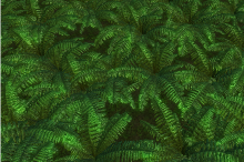
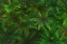
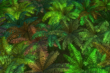
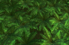
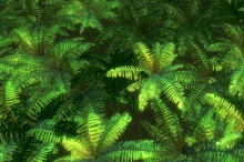
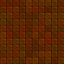
Changing the value randomly can in certain cases simulate shadows (see the middle row below), so that a scene looks like it has more depth than it really has.
In general, this algorithm is:
- Not good for small palettes where high contrast is desired.
- Good for enriching a scene where the base colours are defined and repeated many times.
- Good for colouring tiles with seams (to get more variance with seamless tiles requires a bit more work. See the section Dynamic Colouring in Getting More from Seamless Tiles).
 |
 |
 |
 |
 |
 |
 |
 |
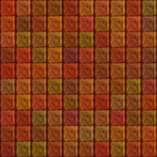 |
The effect of the maximum offset you choose is different based on the base colour:
- The less saturated the base colour, the more colourful the result is perceived.
- Different hues will have different perceived variance. For example, if the base colour is yellow, the result will be perceived as more colourful than if the base colour was green.
4. Selecting from a gradient
In the code examples below, Gradient.GetColor takes a parameter between 0 and 1 and generate the corresponding colour on the gradient.
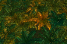
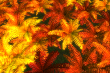
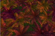
Uniform Random Randomly select values between 0 and 1, and map this to the gradient to select colours. This gives little structure, except for that already inherent in the gradient.
 |
 |
 |
Grid This is useful for selecting a known number of colours, with the assurance that no two colours will be closer to each other (along the gradient) than 1/n.

This is useful for colour which convey information, if the number of colours is small.
Jittered Grid This is useful to get more variety with a small number of colours, where you know the number of colours up front. (The variety is not among the colours, but among different generations).
for(int i = 0; i < n; i++)
   color[i] = gradient.GetColor((i + Random.NextFloat()) * intervalSize)
Using a jittered grid works well for a small selection of colours, so that multiple generations give different results. One disadvantage of using a jittered grid is that colours in the sequence are not guaranteed to be equally distinct from each other. You can address this by limiting the amount of jitter to guarantee a minimum distance between colours:
maxJitter = ...//some value between 0 1nd 1

for(int i = 0; i < n; i++)
   color[i] = gradient.GetColor(
      (i + 0.5 + (2 * Random.NextFloat() - 1) * maxJitter) * intervalSize);


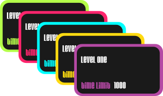
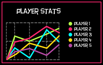
Golden Ratio This is a scheme to select a sequence of colours, not necessarily up front, so that consecutively selected colours are always far from each other. Colours never repeat (although, over time, colours become close to previously chosen colours).
offset = Random.NextFloat();

for (int i = 0; i < n; i++)
   color[i] = gradient.GetColor(offset + (0.618033988749895f * i) % 1);

This algorithm is useful for selecting colours for contrast in an interface, where high contrast between successive colours is guaranteed.
 |
 |
Here is an article explaining why this works:
5. Selecting random channels in other colour spaces
For example, good results can be obtained using the HSL colour space.
Random Hue


Random Saturation

Random Luminance

Random Saturation and Luminance

6. Standard Colour Harmonies
http://www.websiteoptimization.com/speed/tweak/color–harmony/
Methods for choosing random colours for standard colour harmonies all work basically the same: limit the possible choices of hue, and control saturation and luminance. We can use a generic triadic algorithm with suitable parameters to generate a variety colour harmonies:
The algorithm takes a few parameters; the important ones are two offset angles, and two angle ranges.
The simplest form of the algorithm works as follows:
- Select a random reference angle.
- Select a random angle in the total of the range (the three range angles added together)
- If the angle is smaller than the first range, keep it
- Otherwise, if the angle is bigger than the first range, but smaller than the sum of the first Two ranges, offset it by the first offset angle
- Otherwise, offset it by the second offset angle
- Add this angle to the reference angle
- The colour with this angle as hue is a colour generated with the triad harmony
Here is a C# implementation of this algorithm that generates a given number of colours with controlled saturation and luminance.
public static List GenerateColors_Harmony(
   int colorCount,
   float offsetAngle1,
   float offsetAngle2,
   float rangeAngle0,
   float rangeAngle1,
   float rangeAngle2,
   float saturation, float luminance)
{
   List colors = new List();

   float referenceAngle = random.NextFloat() * 360;

   for (int i = 0; i < colorCount; i++)
   {
      float randomAngle =
         random.NextFloat() * (rangeAngle0 + rangeAngle1 + rangeAngle2);

      if (randomAngle > rangeAngle0)
      {
         if (randomAngle < rangeAngle0 + rangeAngle1)
         {
            randomAngle += offsetAngle1;
         }
         else
         {
            randomAngle += offsetAngle2;
         }
      }

      HSL hslColor = new HSL(
         ((referenceAngle + randomAngle) / 360.0f) % 1.0f,
         saturation,
         luminance);

      colors.Add(hslColor.Color);
   }

   return colors;
}
The algorithm can be made a bit more intuitive by centring the reference and offset angles in corresponding ranges.
- Select a random reference angle.
- Select a random angle in the total of the range (the three range angles added together)
- If the angle is smaller than the first range, reduce it by half the first range.
- Otherwise, if the angle is bigger than the first range, but smaller than the sum of the first two ranges, offset it by the first offset angle minus the second range.
- Otherwise, offset it by the second offset angle minus the third range.
- Add this angle to the reference angle.
- The colour with this angle as hue is a colour generated with the triad harmony.
More varieties
- With the centred version of the algorithm, it is easy to supply (instead of generating) the reference angle, making it possible to chain the algorithm with other colour selection algorithms.
- More variety can be added by selecting random saturation and random luminance (possibly within a range from given parameters). This can potentially change the harmonic scheme by fringe colours being emphasized by their saturation / luminance. In many cases this is ok.
- The hue can be selected uniformly instead of randomly across the total range. This will insure colours are a minimum hue-distance apart.
- Withsuitableparameters, we can generate common colour schemes:
- Analogous: Choose second and third ranges 0.
- Complementary: Choose the third range 0, and first offset angle 180.
- Split Complementary: Choose offset angles 180 +/- a small angle. The second and third ranges must be smaller than the difference between the two offset angles.
- Triad: Choose offset angles 120 and 240.


7. Triad Mixing
This algorithm takes three colours, and mixes them randomly to create a palette.
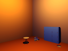
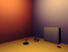
The standard algorithm produces many grey colours. If this is not desired, the amount of greyness can be controlled by limiting the contribution of one of the three colours. This version of the algorithm is given here (if the greyControl is 1, it is equivalent to the standard algorithm).
public static Color RandomMix(Color color1, Color color2, Color color3,
   float greyControl)
{
   int randomIndex = random.NextByte() % 3;

   float mixRatio1 =
      (randomIndex == 0) ? random.NextFloat() * greyControl : random.NextFloat();

   float mixRatio2 =
      (randomIndex == 1) ? random.NextFloat() * greyControl : random.NextFloat();

   float mixRatio3 =
      (randomIndex == 2) ? random.NextFloat() * greyControl : random.NextFloat();

   float sum = mixRatio1 + mixRatio2 + mixRatio3;

   mixRatio1 /= sum;
   mixRatio2 /= sum;
   mixRatio3 /= sum;

   return Color.FromArgb(
      255,
      (byte)(mixRatio1 * color1.R + mixRatio2 * color2.R + mixRatio3 * color3.R),
      (byte)(mixRatio1 * color1.G + mixRatio2 * color2.G + mixRatio3 * color3.G),
      (byte)(mixRatio1 * color1.B + mixRatio2 * color2.B + mixRatio3 * color3.B));
}
Different mixing algorithms can be used, for example subtractive mixing, or hue interpolation.
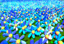
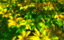
Low Grey Value


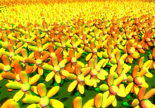
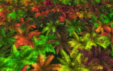
Medium Grey Value


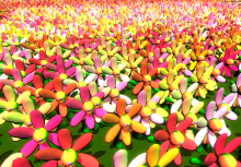
High Grey Value


 |
 |
 |
 |
 |
 |
 |
 |
 |
 |
 |
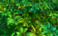 |
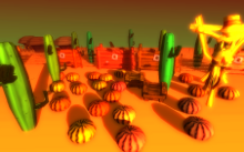
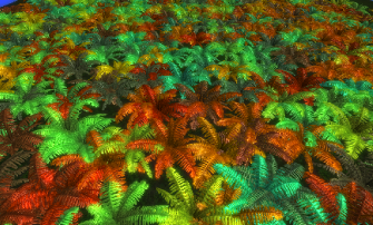
Below you can see the effect of setting the grey value. On the left it is 0, on the right it is 1.
 |
 |
Monochromatic Textures are Boring
Unlike hand-painted textures, textures altered procedurally can look flat and uninteresting.
There are several ways to deal with this issue. All of them require intensive artist input, but it is important to understand the techniques and how they work (and how they will affect the art pipeline).
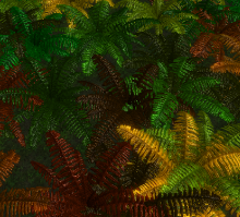
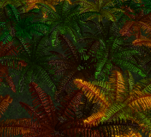
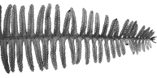
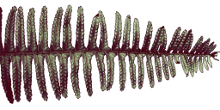
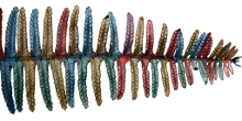
Use coloured textures. The base textures need not be totally greyscale. Painting them with colours will offset the final colour, and can be used for local colour variations.
 |
 |
 |
 |
 |
 |
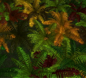
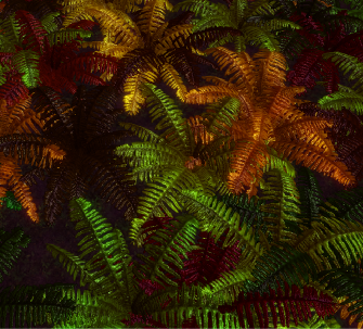
Channel independent colour correction. Sometimes a good effect can be obtained by adjusting values for channels independently, for example, by a post-effect. In the example below, for example, shadows have been made a bit redder. (The image without any colour correction is shown on the left).
 |
 |
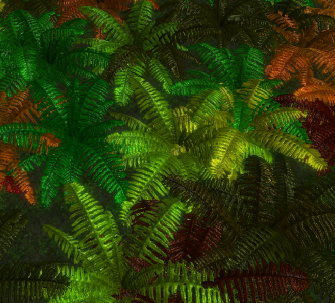
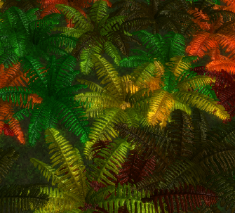
Using coloured lights. By using coloured lights at slightly different angles, flat textures become more nuanced. Below, the scenes below are lit with the same three lights, but on the right the lights are coloured red, blue and green (and 3 times the intensity to compensate for the missing channels in each light).
 |
 |
Preparing Art
Preparing the art requires careful planning. The biggest challenge is figuring out how to consistently separate textures. To give you an idea of what is involved, here is how I prepared the images for this article:
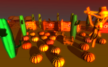
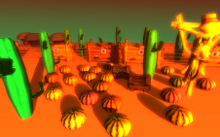
- The ferns use a single material. Each fern randomly selects a colour from the currently set up scheme, so I could just plunk the script on the colour selection script.
- The flowers use different materials for each part. Only the petals must change colour, so I had to modify the script to link to a part of the mesh (the petals) to adjust the colours.
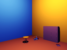
- The room scene again uses separate materials for each part of the mesh. In this case I used a global script that sets the colours of all submeshes.
You can see that it can become complicated, especially if you colour different elements using different algorithms, and have complicated objects.
There are a few other tips when it comes to preparing the art:
- If you multiply your grey textures with procedural colours, textures that covers a wide grey spectrum are more flexible. Your colour application algorithm or the colours you choose can always reduce the final contrast, but it’s much harder to put it back in.
- Carefully plan how you will tweak the final result, to minimise back and forth. (This is a general art principle, but becomes even more important if you use this technique). For example, to there are at least four ways to make something darker: change the texture, change the input of the colour selection algorithm, or change the lighting, or change the post effects. You can easily land in a tweaking loop that can waste a lot of time. One strategy is to get base levels for all these, and then tweaking them in this order: texture, algorithm, lighting, post effects.
- In some cases it may be useful to use index colours, where each index corresponds to a colour from the palette, instead of using separate materials for each colour.
- To gain performance at the expense of disk space, you can pregenerate your textures.
Download
C# source code with all the algorithms explained here.
Related
(Plug) We (at Gamelogic) have implemented these algorithms as a Unity plugin.
Thanks
- Jarred Lunt made the art for the desert scene.
- Ciaran Prince made the art for the room and flower scenes.
Thanks guys!
Wow, great article. Thank you.
I appreciated your detailed examples and was struck by how much life a bit of algorithmic color variation can breathe into a texture.
Pingback: Színválasztó algoritmusok « MolePlex
Another amazing article.
Thanks for the quality posts. Keep up the good work.
“Here is more information on colour contrast effects:”
http://www.uxmatters.com/mt/archives/2006/01/color-theory-for-digital-displays-a-quick-reference-part-ii.php#colorContrastEffects
I stared hard at the examples on this site and I just don’t see the effects described!
“When surrounded by magenta, silver (#CCCCCC) appears greenish; when surrounded by green, pinkish. Chrysoprase green (#00FF99) appears cool, or bluish, when surrounded by yellow (#FFFF00); warm, or yellowish, when surrounded by blue (#0000FF).”
Not to me I’m afraid.
“The rectangle on the left has an orange cast; that on the right, a blue-green cast.”
Absolutely identical to my eyes.
“However, in the horizontal bars, the same hues appear to change as their background colors change.”
I can just about perceive an apparent minuscule change in brightness, but the hue looks identical.
“On the same principle, two different hues can appear to be the same, depending on their background colors.”
Actually, the first thing I thought was, ‘Oh, two different colour blue squares’.
Hi John,
Hmmm interesting. There are differences between people, and differences between screens (probably more likely) that may explain why you perceived this differently from the author (and me). (Someone else also pointed out that the greys in the example I gave look evenly spaced on his screen). So I guess the main point is that perceptual distance cannot be reliably calculated by any method.
Excellent article. Have you ever considered writing a book?
Could not download the code. Seems to be corrupted.
May just be because of the increased traffic. Try it again, see if it works. Several of us have no problem.
Great article. Incredibly interesting.
Thank you.
very good article, thx man
Pingback: How to Choose Colours Procedurally (Algorithms) | Just Link
Very nice article and wow, it brought back memories. I used some of these techniques some years back in my Master’s project. Where I employed them in the recognition and identification of, of all things, wines! (yeah, the ones you drink) 😎
Nice article, thanks!
I think the golden ratio color selection is the most widely used code that I ever wrote 🙂
Thanks Martin, for your comment and your post 🙂
It’s a piece of code that is remarkably simple, with just a dash of the unintuitive (almost exotic) (in the if-you’re-not-a-math-guru sense) to delight.
Pingback: Colors, Locality & QuakeCon « Kynosarges Weblog
Pingback: Gentrieve 2 Update: v0.54a «
Absolutely fantastic!!
Fantastic! You could also possibly choose such palettes by using such a metric as temperature and then creating level-sets / contours in the lab space.
Great article, rich with information, algorithms, and references! Grabbed it with pocket for careful rereading while train commuting. Thanks Herman.
Haha I just read this on the train now
Pingback: Joel Cochran » Weekly roundup 9/28/12
Pingback: Aymeric Lamboley » Create a game like Tiny Wings
Pingback: Procedural colors
In addition to Lab color (which everyone interested in color should read about), take a look at the HCL color space, which gives the benefits of Lab with some of the convenience of HSL: http://hclcolor.com/
Pingback: 40+ Fantastic Game Development Tutorials From Across the Web | Gamedevtuts+
Pingback: Devicezero Game Dev » How to Choose Colours Procedurally
Great article. However I think it’s important to mention color vision deficiency when it comes to game development. Around 10% of the male population suffer from this in some form, which adds up to quite many gamers. When it comes to vital game elements, such as distinguishing friendly units and foes, it is best not to use only color but also shapes or patterns. For example Battlefield 3 was released initially with only colors, very bad color chosing for color vision deficient as well, to distuingish enemies from friends and they were drowned with angry emails from people with color vision deficiency who could not play the game (myself included). It was eventually patched, but capturing this issue early in the development phase (or at least test phase) would have saved a lot of time and money.
It is indeed important; and I wonder if it is possible to filter (or adjust) the colours generated by these algorithms to avoid the mistakes that humans make. Definitely something to think about. Thanks for the comment!
Pingback: ???????????? | ??????
Pingback: Procedural Colors | Adventures in Game Development
Pingback: ??????????????? | GamerBoom.com ???
What a superb article! I have been programming colour style variations and this is a great set of algorithms.
Pingback: How to choose colours procedurally? | stackoverflow1453
While the article is superbly written and something i have been waiting for for quite a long time. the yellow color of the links simply hurts the eyes.
Thanks for the feedback. For now, I made it the proper orange (I see it’s very light on some displays), but we will tweak it some more.
The color box image is straight of Itten’s book, right? That’s a great book.
I did not know of that book, but it looks worth the read. (I am sure though indirectly the images can be traced back to that source. I did adapt them slightly to use Dev.Mag orange and green :P)
“In each row, the hue differs by 5%. Notice that certain colours cannot be distinguished. ” I was able to distinguish all the colors (but some with more difficulty), this probably depends entirely on the monitor & colour profile.
Indeed; some others reported discrepancies as well. I have updated the post to reflect this.
Pingback: Les liens de la semaine – Édition #45 | French Coding
Pingback: My terribly unordered unordered lists | Frontfacing - A blog about Frontend Development, TYPO3 and Me
Wow, to Complete, it’s amazing post, i like it, now i am search inspiration for my new blog from my friends
Vina
Pingback: A cheat for seamless hex tiles | Gamelogic
i love this article thank you for the information so many syntax and i think that not easy to made.. Lagu Galau Korea
Pingback: ??????????????? - ???
Pingback: Bookmarks for September 2nd | Chris's Digital Detritus
Ru
??? ????? ??????????????(??????????????? )?????
This article is saturated (pun intended) with useful information. Thank you so much
Pingback: mga/blog » Generative ebook covers
Pingback: Notes on procedural content generation | entropicMirror
Great site. Full of information for independant developers.
I love the fact that nowadays plenty of independant developers can give birth to otherwise never-born great concepts!
I see plenty of amazing new ideas florishing on kickstarter or indiegogo these days and that’s amazing to see so much creativity.
some very few examples I came across these past days:
https://www.indiegogo.com/projects/dual-madness/x/9643832
https://www.indiegogo.com/projects/pongish-9-to-5-minim/x/9643832
https://www.kickstarter.com/projects/eigenbom/moonman?ref=category
…
all very different bu amazing in concepts and there are plenty others.
This is mainly thanks to blogs like yours and thats awesome.
Pingback: PiBox: XM radio app (PiXM) and wifi scanning in PNC | Michael J. Hammel
Pingback: PiBox: XM radio app (PiXM) and wifi scanning in PNC – PiBox